So here I am back so soon after my declaration of freedom and writing about SF again, right off the bat. Hah-hah... That's really kind of funny in a way. But what I'm ranting about today is not funny in the slightest. No seriously.
Why is it that science fiction (and fantasy) in America, and to a lesser extent elsewhere, is not taken seriously by the masses? Is it the numerous cliche SF movies that were made in the 60s and 70s? Is it the fact that the genre is associated with grease faced, be-pimpled teen fanboys and socially inept, overweight adult computer programmers wearing t-shirts that say things like "+10 frost resistance" and "There's no place like 127.o.o.1"? Is it because the "literary" (please try to pronounce that with a sing-song voice, whilst twittering your arms about in the air, "lit-er-air-ie!") authors, who from time to time lay down some SF and then refuse to allow their books to be categorized as such or pull them from SF award nominations? (Yes, yes, I'm talking to you Salman Rushdie and Margaret Atwood) Is it the libraries with their two spinners of well-thumbed paperback all with the "nuclear atom" sticker on the spine detonating the SF section? Well, the answers is NO. Okay, fine - yes, maybe those ideas effect the genre status a little bit, but the real problem is...
THE COVER ART!
Now, don't get me wrong, there are some great and talented artist working in the field today and yesterday. And some of it is the fault of the author themselves... Some of the stories really do suck, it can't be helped. For the most part however, this is the choice of the publisher. So, I may, here a few examples to show you all what I am thinking about. Please Note: These are just the things and examples that come to me on the fly, or that I know from experience. I mean no offense to any authors, fans, artists or whomever. I'm also sure that for every example I give there are ten examples that counter my stupid thesis (and ten others, even more apt). Too bad, this is what I am ranting about today so get off my case!
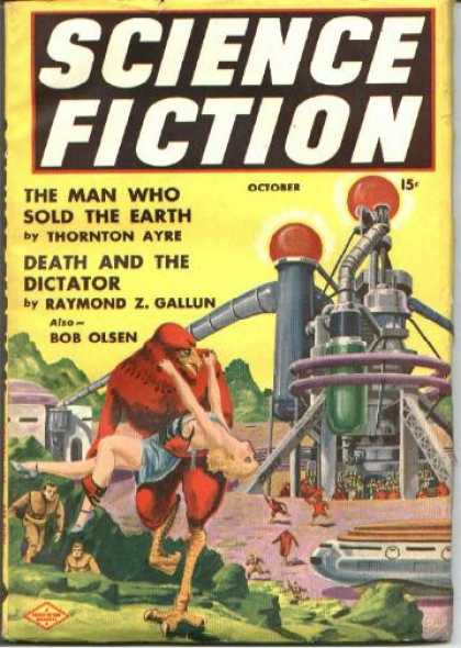 -The Early SF Periodicals
Let's start with some SF from the 50s and 60s. These two covers are archetypal of the era. On the left we have a bird-looking biped carrying a scantily clad blonde, a couple of stranded astronauts chasing her, all against a backdrop of some "futuristic" machinery. For some reason in this time of SF, almost everything had a buxom young thing being carried
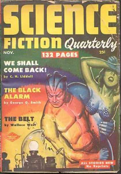 off by some form of monster or maybe being rescued by the lad wearing the jetpack. Yup, it was just that grand. No wonder no one took us seriously then! On the right there is there is the other stereotype... oh, wait, I thought for sure I had something else for this era. Nope, just more ta-tas and beasties. That really seemed to be the standard for these decades. Not much hack work as far as the writing goes, there are some very standard names in SF publishing here and almost everyone, without reservation, got their start writing for these and other similar periodicals of the day. Unfortunately they were overwhelmed by bad art. Maybe not even the technical quality of the art was bad, so much as the subject matter at hand. The other problem here and throughout modern day? The pictures rarely, if ever, directly related to the story at hand.
-The SF Mass Market Paperbacks
Straight to paperback fiction. I realize not every author can get the hardcover deals, nor should they. Especially new authors, at least until they prove themselves. And yes, yes, I realize the authors have nothing to do with the art on their books. No need to point it out. But, anyway, this sub-category lends itself to bad science fiction art like no one's business. Here a couple, that are particularly bad.

 The first, on the left is probably (sadly) one of the most famous sci-fi books out there, by a gentleman who invented his own religion no less! This new edition sports the casual "Hey baby, I've got these two lasers here, sure do hope I'm hitting the bad guys, while I gaze longingly into you eyes. Wanna feel my rippling abs?" On the right we have another common theme (a throwback to the early periodicals), "science fiction is really sexy if you have chicks and some robotic asteroid mishmash on the cover". And this coming from one of the most respected literary authors around, Kurt Vonnegut. Since this was only his second book, however, one cannot fault him for the publisher's misdeeds. So anyway, you get the paperback original idea. I probably could come up with better examples, but I feel not like searching. Ripply hero's, laser beams and sexed up aliens just don't do it for me. Sorry guys!
-The "Judge A Book By It's Cover" Variety
Sometime you just have to do just that. Sometimes our critics are right, I'm so very sorry to say. This goes against everything we have ever been taught, and that... sucks.
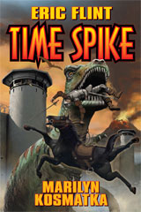
 However "the exception that proves the rule" is often only too apt. I have very little else to say about these, I'll just show you what I mean. And I'm really, really sorry Eric Flint, I'm just not ever going to read one of your books, please stop this nonsense. First there is a dinosaur, eating a medieval knight on horseback all set against the lovely backdrop of... what is that a Nazi fort circa 1944? Hmmm... looks great. Second: Brooding hero, a chipmunk turned jedi and giant robotic spiders! Then there are the next two.
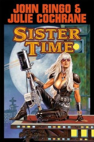
 Again, on the left, we are forced into the "space chicks with giant guns and um... giant guns" cliche. And finally, another lovely contribution from Mr. Flint. Conquistadors squaring off against some guys in a jeep. Thanks dude. No really, it makes sure that I will not waste any time picking that one up. I have a really hard time understanding how the publishers see this as a great marketing strategy for selling novels, but hey, that's just me. Obviously they do it for a reason.
-Common Work Today
And that leads me to my final example on science fiction cover art. These following pics are from some of the biggest
 (or at least most critically acclaimed up-and-coming) names in the genre today. While I feel slightly more at ease with these work's covers (and more comfortable reading them on public transportation)
 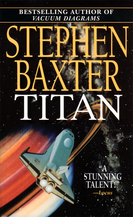 they are in fact, just boring. The new ideas for major SF cover art today seem all to vary on a single theme. Take one spaceship or space station and place it in front of a extra-solar (or local for that matter) planet or maybe have it back dropping some form of galactic object, such as a supernova or nebula.
  Don't get me wrong, it's very pretty and technically proficient, but if you see enough of this you soon begin to forget what cover belongs with what book and start buying doubles of titles you already have at home each time you go to a used book sale. And that my friend, is frustrating indeed.
-Conclusion
Again these are just my thoughts. That's why it's my name at the top of the blog. So I take full responsibility if I offended anyone. But it's how I feel. And to top it off I'm one of those people who bitches about something and then offers up no solution to fix it. I'm not sure what I'd prefer too see on the covers or what would give the genre more street cred. Yes, by street cred, I mean amongst the literary crowd. Yes, I realize that it's a terrible allusion. Shove off again please. :-) A particular favorite publisher of mine, based out of the UK, named Gollancz and under their Orion print has done some extremely interesting work on cover art recently. They started a series called "future classics" in which they re-print 6 newer SF titles, repackaging them up with the aim to appeal to greater audiences. Sorry, I'm too tired to post images for them, but feel free to link back to the article/interview and check them out. Very interesting abstract and minimalist work, which however, has been meet with mixed reviews. Although enough sales for them to plan a new line in 2009. So some people are trying anyway. Here's my "good luck tumbs up" to anyone who can change things or anyone who makes an attempt. Me, I'll just slip that dustjacket off at home for the meantime and enjoy reading the new Ben Bova in the cafeteria at work tomorrow.
"The world is governed more by appearances than realities, so that it is fully as necessary to seem to know something as to know it." Daniel Webster (1782-1852)